
Italian Society
November 2022
In this project, I completely transformed the visual identity of the Italian Society of UAL. Every element, from typography to colour palettes, was carefully chosen to create a cohesive and compelling new look. The result is a minimal and modern look designed to appeal to both Italian and foreign audiences.
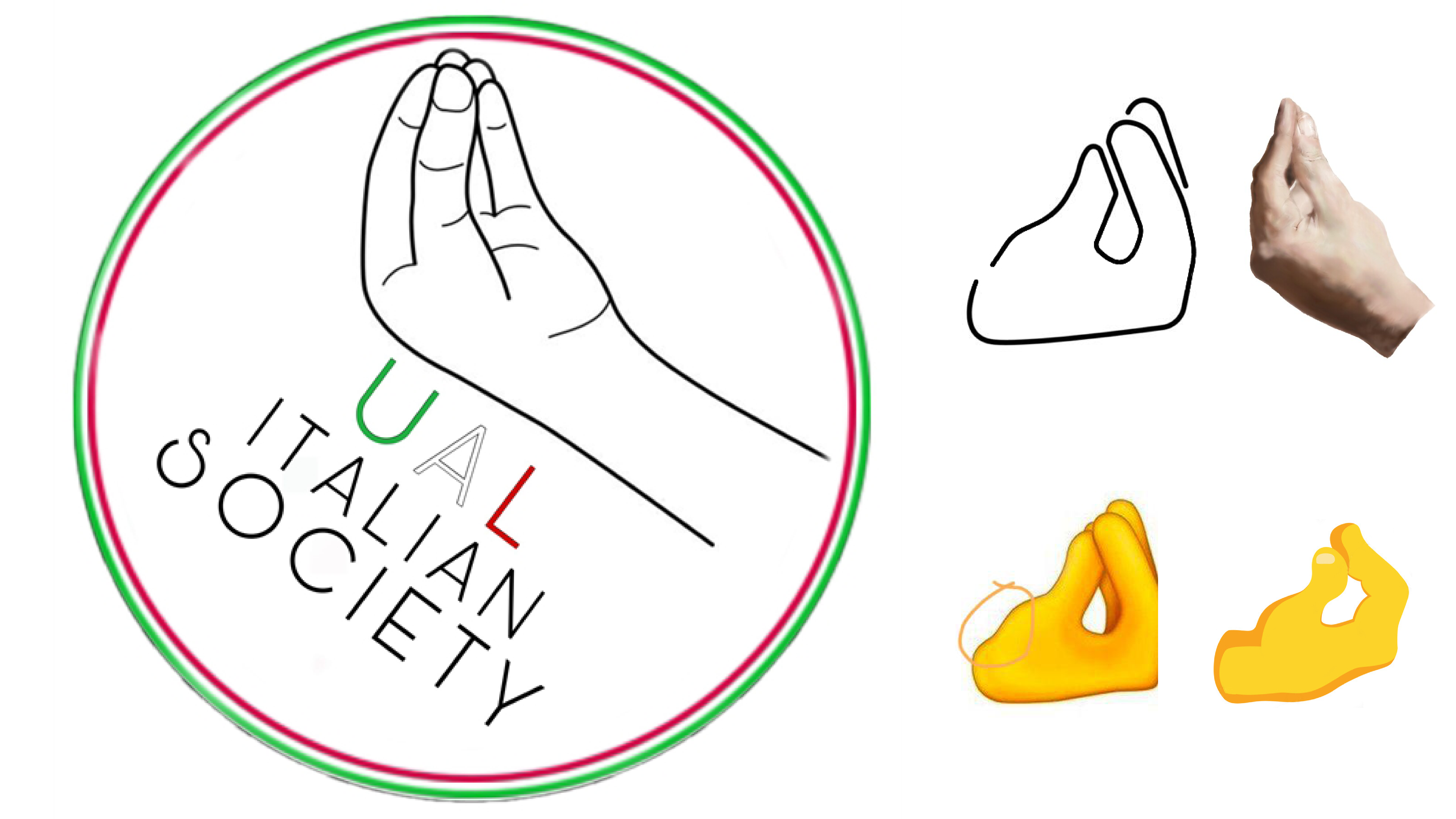
The objective of the re-branding for the UAL Italian Society was to create a visual identity that would immediately recall to an Italian affiliation. To achieve this, I incorporated the iconic “Manina” (little hand), a symbol that I found out to be the most representative of Italian identity. The logo was also designed to be clear, elegant, and exude a modern/urban aesthetic.
To accomplish this, I carefully selected the colour scheme, using green as the primary colour, white as the secondary, and black as the tertiary, in order to create the best visual composition that would appeal to the eye.
I also used a geometric construction to ensure that all elements of the logo, including the logo and logotype, were in harmony with each other.
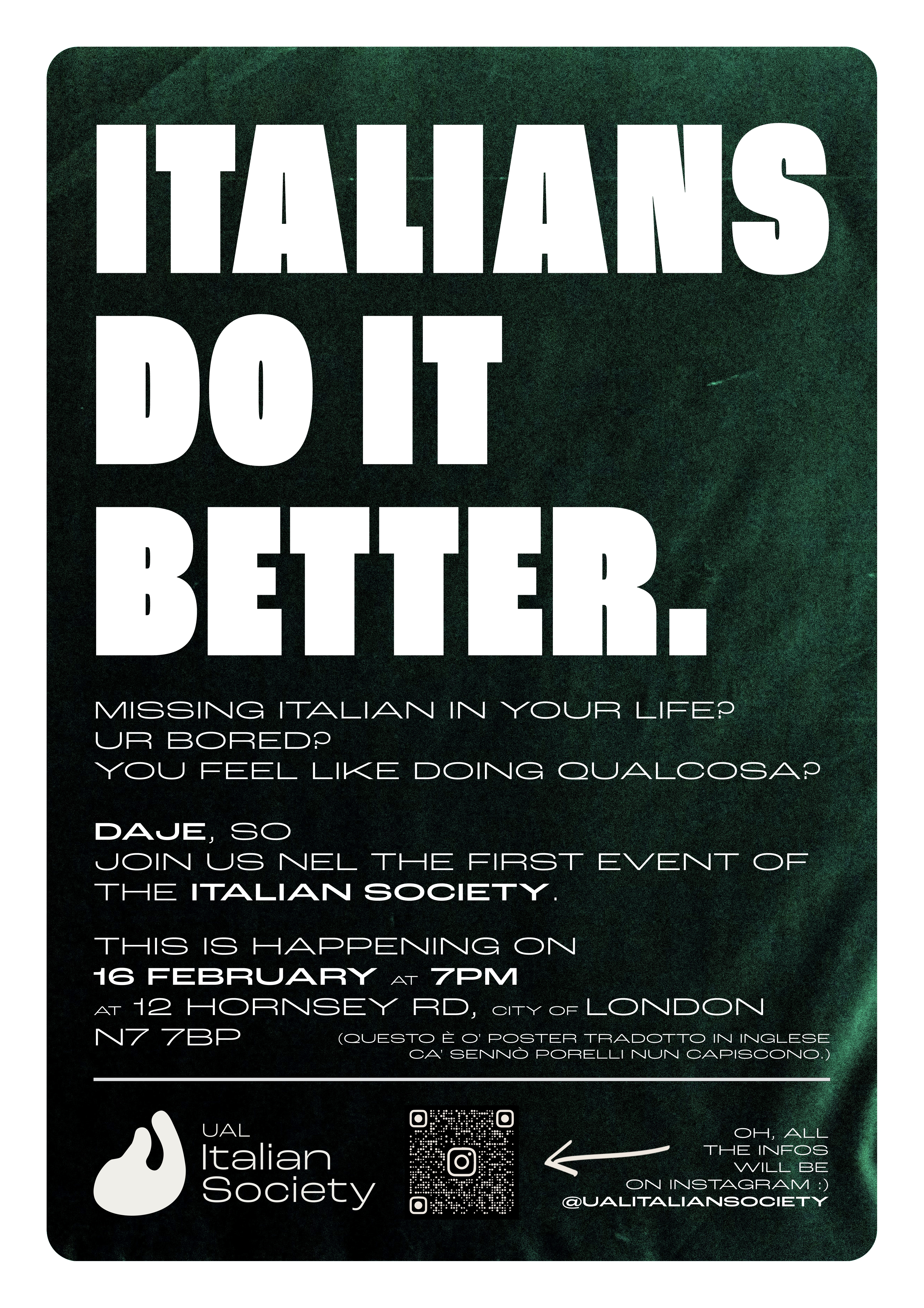


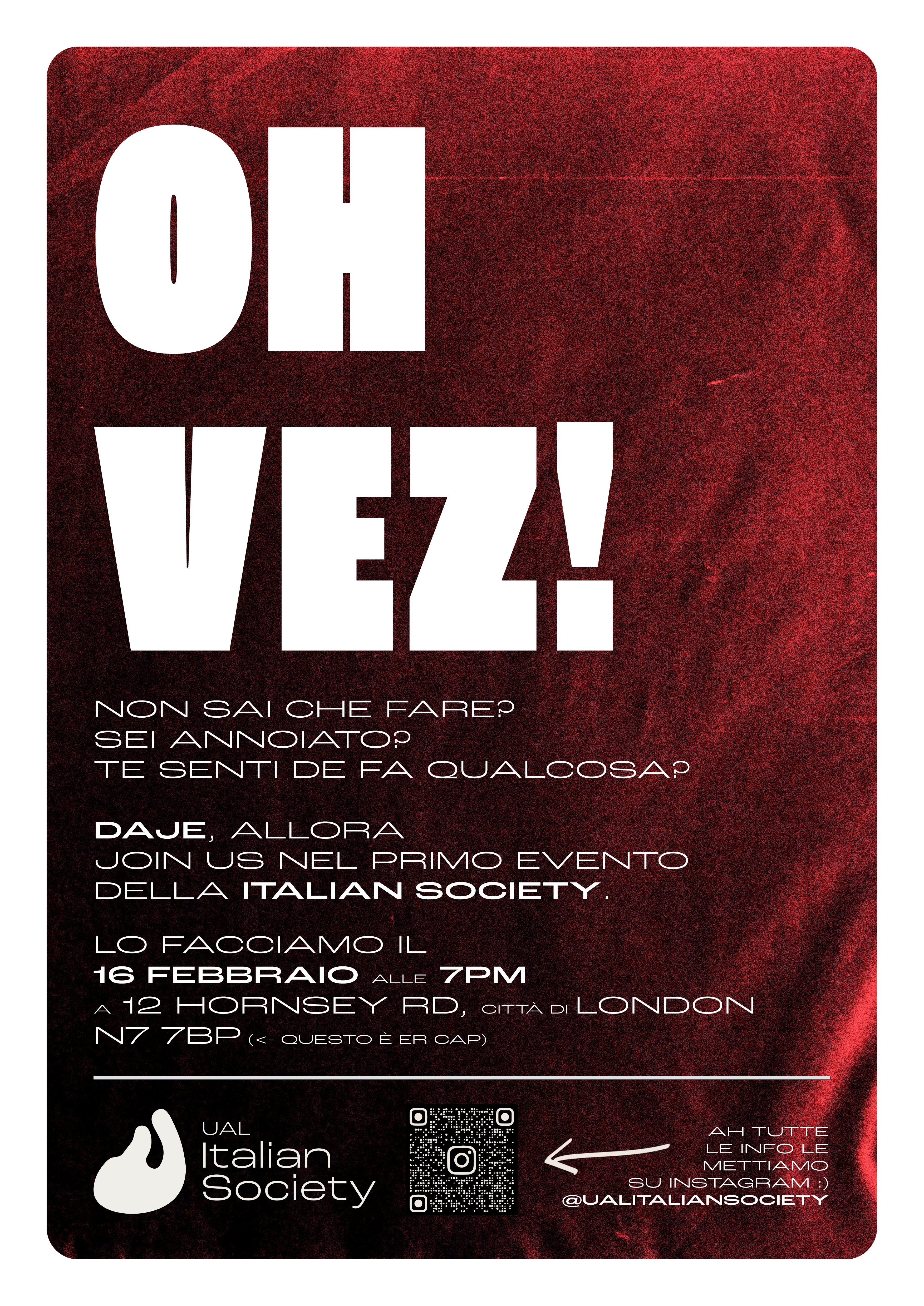


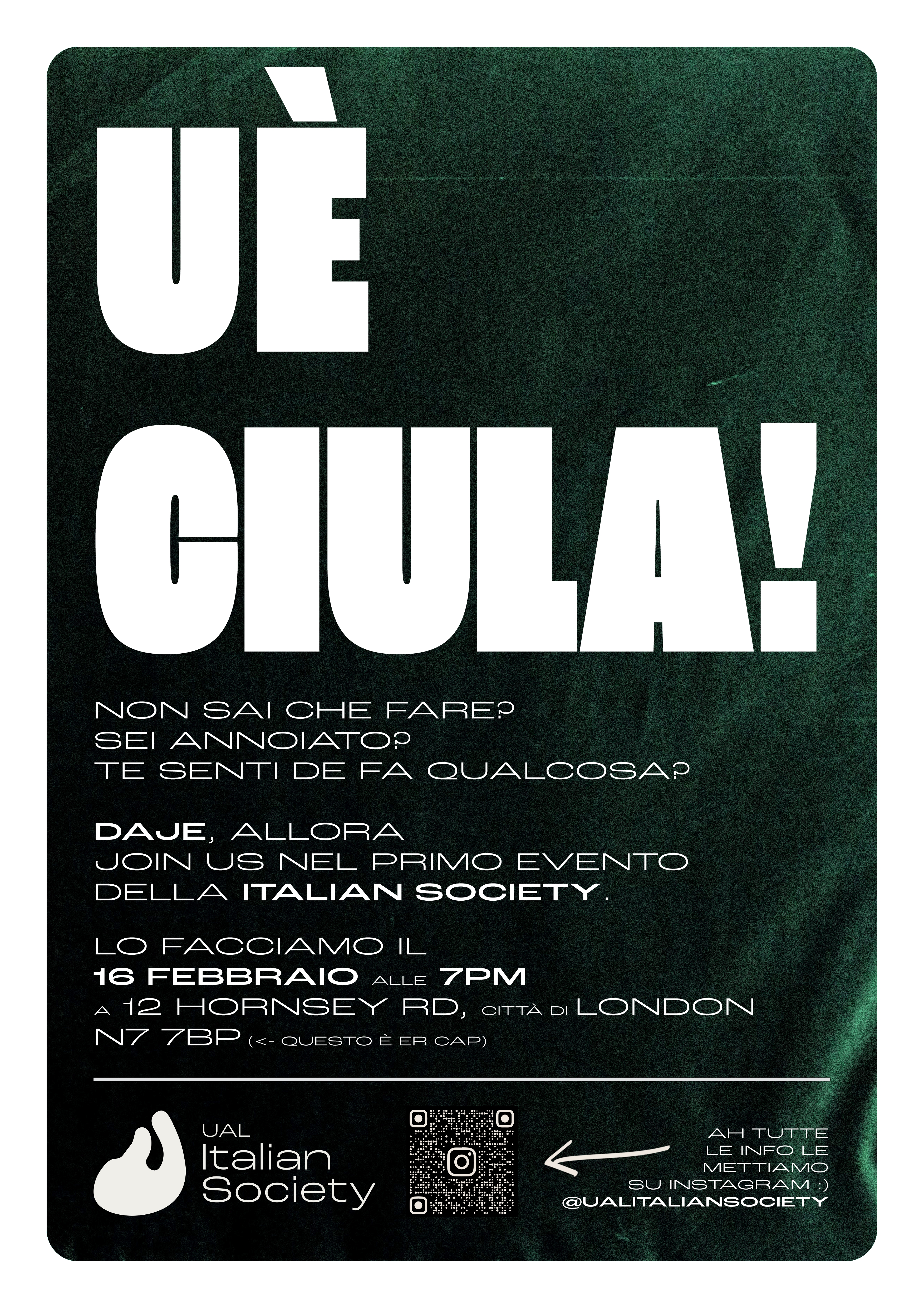
Posters
The posters are designed to be seen from a distance and to be printed on a cheap recycled paper, the typography reflects Italian cultural and historical catch phases from all various dialects from Italy, such as the “Uè Ciula!” from Milanese and “Jamm Ja!” from Napolitan.
Promo
To validate the effectiveness of the new visual identity, I tested it on the society’s existing Instagram page, which is used as main platform to communicate with its audience.
This allowed me to assess its performance and make any necessary adjustments. After determining that the identity was working, I created a promo video to unveil the re-branding of the society.
The video was intended to be used for promoting the first event, made with Adobe After Effects, it had meme references to Italy to attact the audience on Instagram.
References
Focusing on Italian themes of belonging and place.
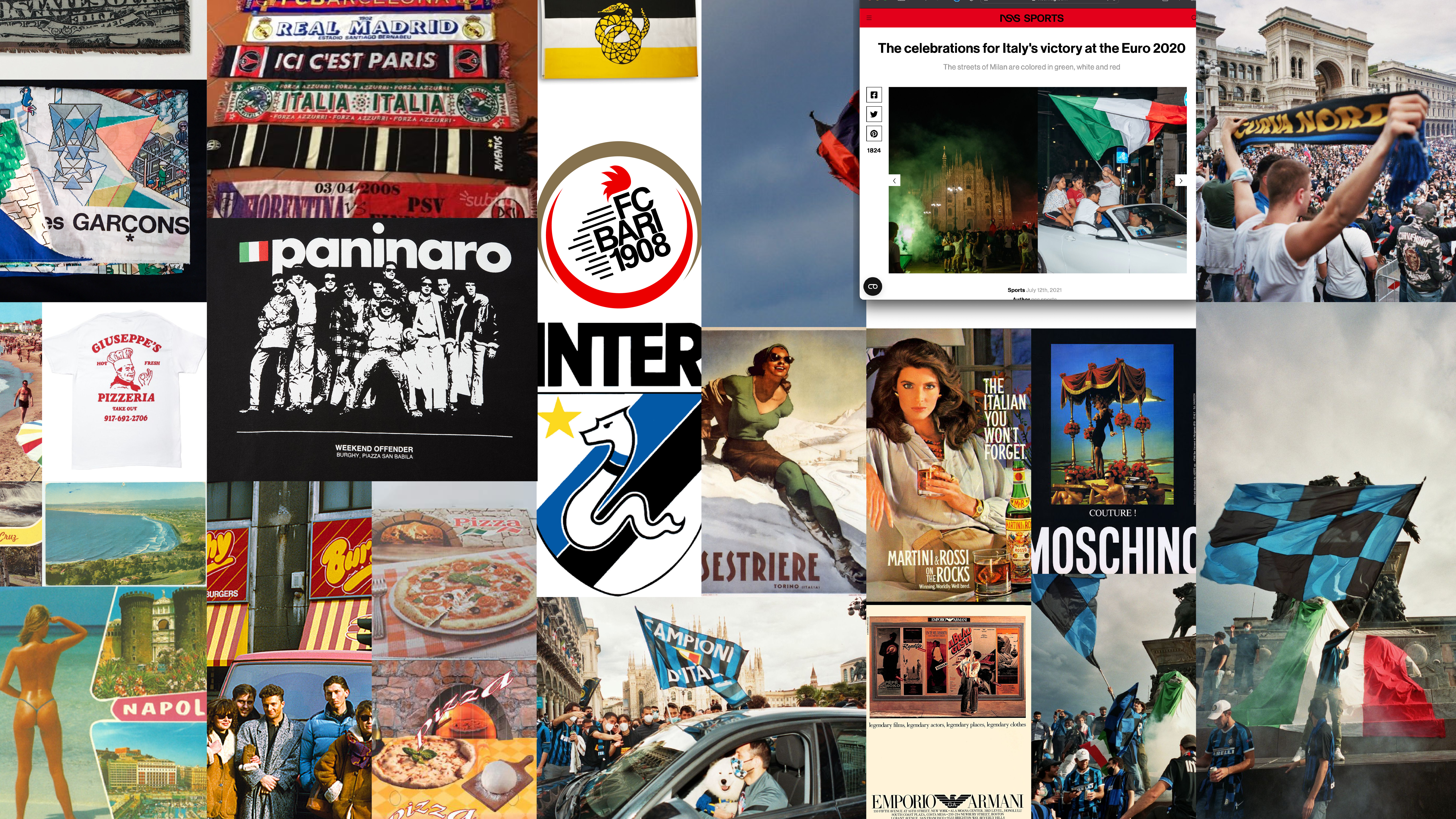
I used references such as the photographs of Toni Brugnoli, a 1990-class street photographer from the suburbs of Milan, who captured images of Italian most personal and cultural celebrations, like the 2020 European championship win and Inter’s Scudetto win. I also looked into the materials as hooligans football scarves, at flag archive fashion garments like Comme des Garcons.
I also looked at nostalgic elements like postcards from the 1980s, and references to the visual identity of a famous Milanese fast food restaurant, Burghy. Lastly, I looked at how people dressed in the 80’s, referencing the so-called “paninari”.
Old Logo and visual references
After conducting thorough research on the typical stereotypes that represent Italians, I determined that the most recognized symbol that recalls to Italy among both Italians and foreigners was the hand gesture, commonly known as the “manina”.
This symbol has been used throughout history to represent Italy and its culture, it was also part of the old society’s logo, which I am the current president of, since it was re-branded in conjunction with this project.
In order to select the right representation of the hand gesture, I examined different styles, both in the form of illustrations and emojis.
Not only was the hand gesture a fitting symbol for the project, but I also chose it as it is part of any smartphone’s emoji collection, making it accessible for people to use and share.
Prototyping
Go big or go home.
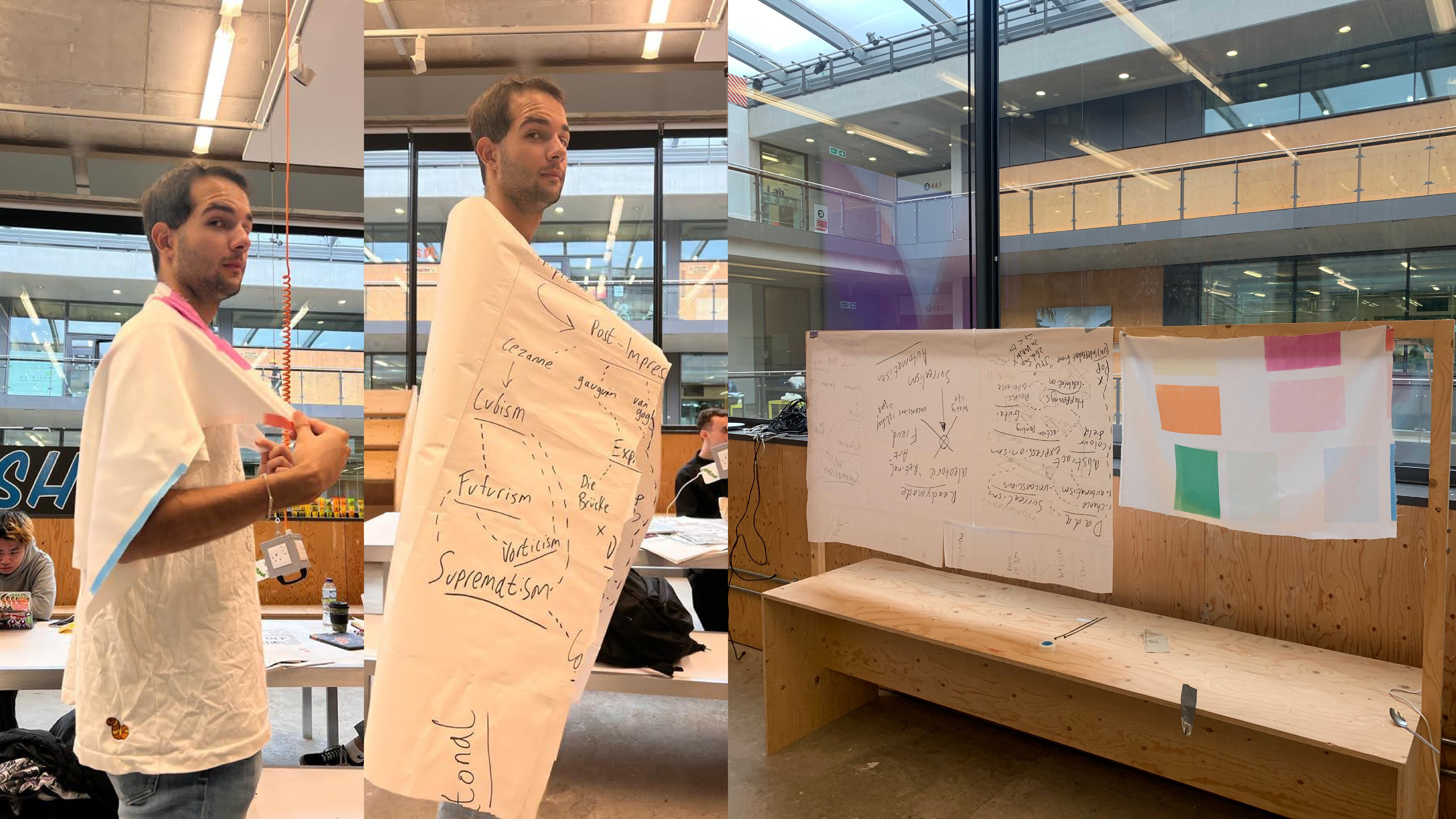
Determining the appropriate size for the flag was an important task that I had to carry out. I then researched to determine what was the typical size for a flag of the characteristics I had in mind, it had to be possible to wear (as in the shown reference).
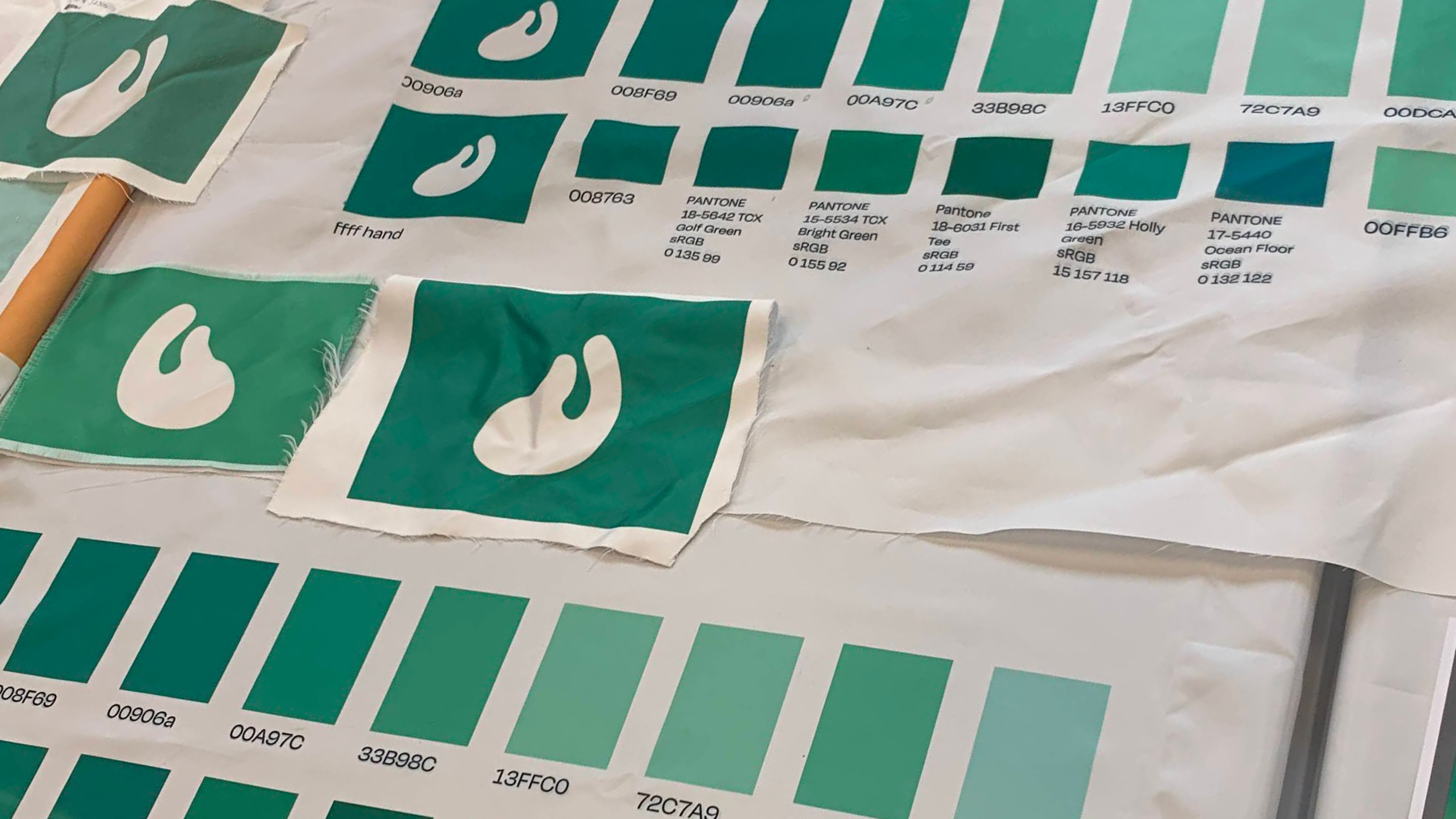
One of the most challenging aspects of this project was selecting the right colour. I initially experimented with different colours such as: magenta, light blue, red, yellow, and green. After receiving feedback from my peers, I found that green was the best choice as it was the most representative of the Italian culture, it recalled to Italy’s national flag, nature and countryside and so on.
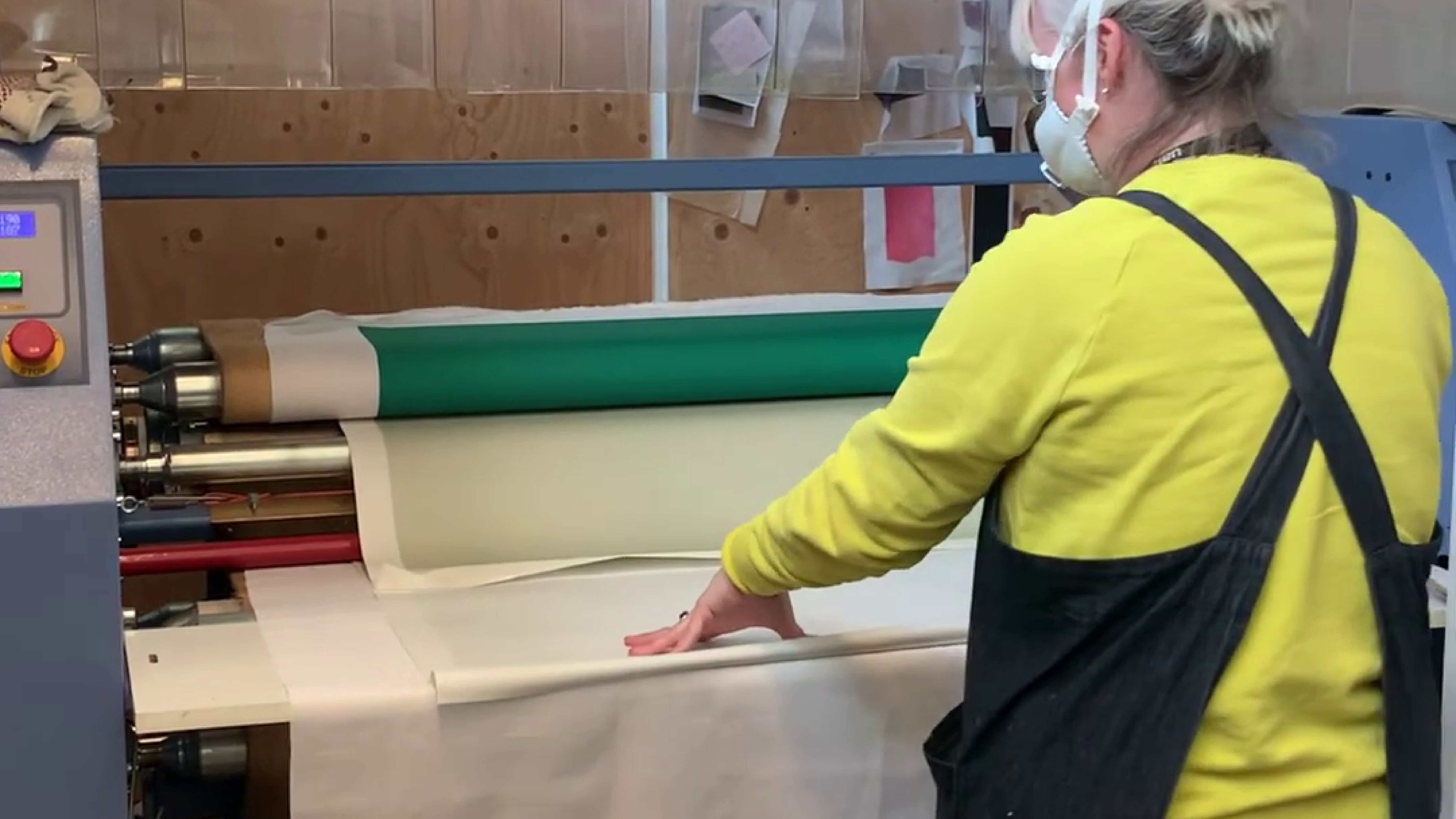
The process used for printing the flag involved utilizing the Rotary Press printer, this method involves printing the design onto a specific type of paper, one for, sublimation, the paper is then taken to a different lab to be heated on the fabric using the a Rotary Press printer.

Audience
The intended audience were Italian students from UAL colleges living in London.
In considering who would be viewing the logo and visual identity, it was important to me to create something that was easily understandable to both Italian individuals and foreigners, this is one of the reasons of why I chose to use the “Manina” (little hand) symbol, which is widely recognized as a symbol representing Italy.
And because the specific meaning of the “Manina” symbol are not widely known, it can also serve as a conversation starter among the target audience, which is primarily of young people between the ages of 18 and 30.